For this exercise I looked through all the drawings, printing, painting etc that I have done since the first assignment, and picked square sections that seemed to me to have potential for further development. I found that almost all of my drawings had one part or another which could be developed further. I was supposed to pick 'at least 4' and ended up picking out 7. I stuck them up on a board.
 |
| Samples for design exercise - 'enhanced' and cropped on computer |
I am definitely finding the arrangement of elements/ contrast of colour shape and detail much easier now I have been through the section on this.
And after reading Metropolitan Seminars in Art: Portfolio 5 Composition as Pattern by John Canaday, pub 1958 by The Metropolitan Museum of Art NY. This helped me to understand the difference between composition in two dimensions, and in three dimensions. This portfolio concentrates on 2D composition of great paintings from the MMA collection, from Holbein to Matisse and Toulouse Lautrec via Japanese and Persian decorative art. What I learned was that what matters is different shapes, contrast, line, (as suggested in the course work for this course) and the sensibilities of the artist, and that it isn't something there are rules you can stick to for this. You have to do what feels right to you. Which is liberating in a way.
Picking a small section of a drawing really concentrates the mind on what is most interesting about each bit. I was a little worried that they'd all end up looking the same, but they don't at all - they all look interesting to me, but each in its own way. I have scribbled my responses to each one in my sketchbook. I'm not so sure at this point whether each of these will repay further work. I guess I will know more about that when I've done the rest of the exercise.
 |
| 'Big Wave' adjusted by using picmonkey infrared. |
The first one I picked was the one that is not in the group above, the one I call big wave. The white pencil is quite faint, so this one is enhanced on the computer to show the lines. I started by following the suggestions in the course work.
I copied the big wave onto the computer and edited it through picmonkey.com, to give me a variety of
different versions.
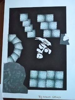
After a while I became aware of having restricted myself by calling it the big wave. I saw a face, and used that as another pattern.
 |
| Oil pastels on black paper. The colours were dark for the 'swell' of the wave and lighter for the reflections and froth. |
 |
| 'Big wave' in white gouache. I focussed on the curved lines for this one. |
 |
| Trying out colours and collage Stripes and curves I also tried cutting out shapes to show a different colour underneath |
different versions.
 |

I printed off a lot of small squares of the infrared version above, and arranged them in various ways to make new patterns.
I like the way the negative areas become more important and shapeful when the pattern is repeated. For instance, in the bottom right hand corner there is a dark square in the join between 4 squares.
After a while I became aware of having restricted myself by calling it the big wave. I saw a face, and used that as another pattern.
Then I looked back at what I had done. I liked the blue and orange together, but not so obviously stripey. And I liked seeing the face in the middle of the apparently random curves.
I also wondered if I could do something with shell shapes, since the original drawing was part of a shell.
This is what I came up with...
 |
| The man of the sea. This was made with shell-shaped stencils and gouache watercolour, with aquarelle orange pencil decoration over it. |
I have enjoyed this exploration and creative freedom so much that I have spent the whole day 'doing' this one drawing.
No comments:
Post a Comment