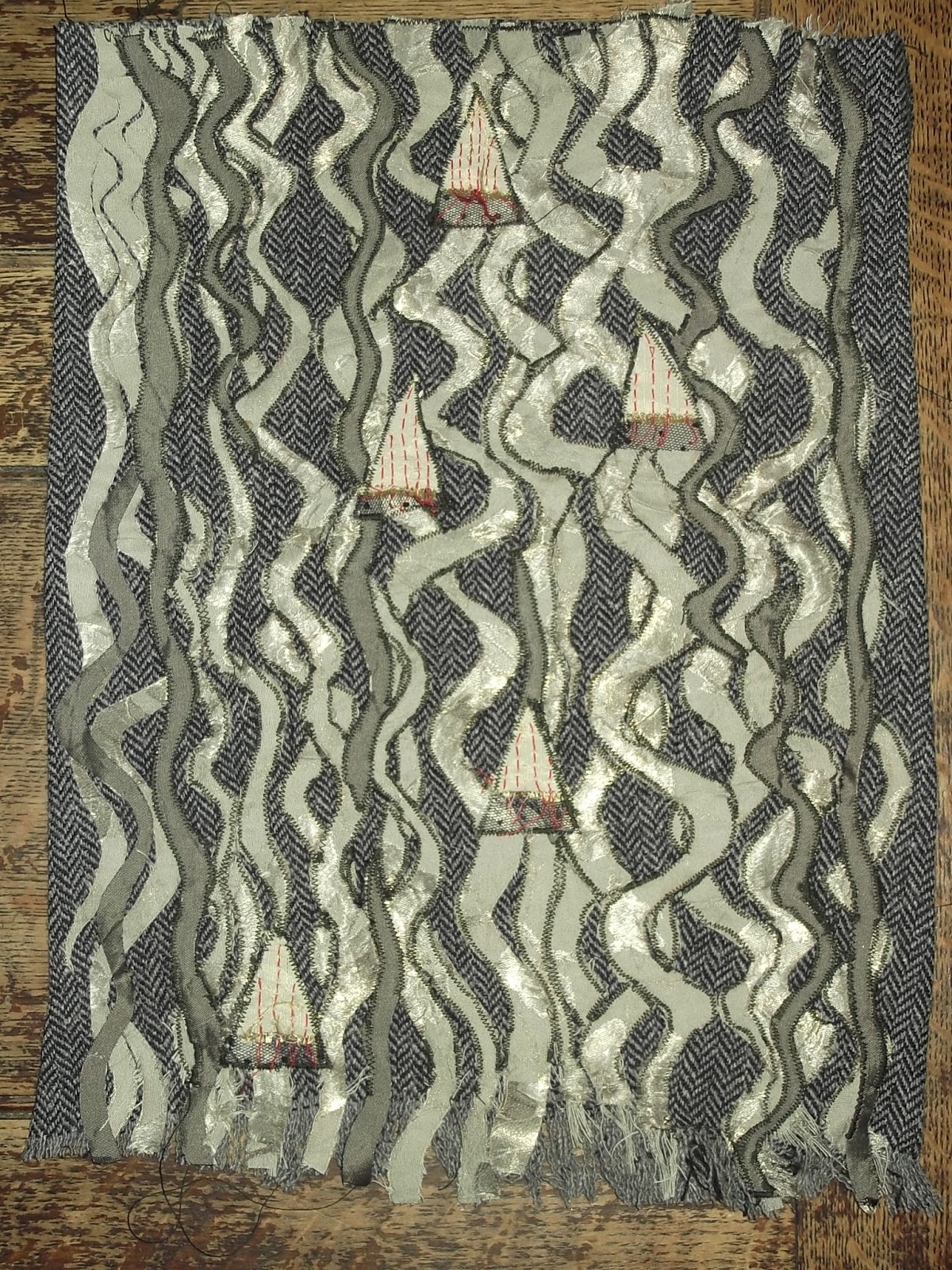
To do this I chose a fabric with both matt and shiny areas in a warm neutral colour, and another darker mid-shine polyester lining fabric. The triangles had to be paler and more matt in order to show up against this complexity.
Initial choice of fabric

Thinking about the edges, it was obvious to me that the bottom needed to be frayed in order to allow the movement downward in waves to continue. However, the edges should be clean and square as the general impression of the lines needs to be clean and not at all blurry.
 |
| White and gold acrylic paint in different proportions and collage on black paper |
Doing a brief colour study in my sketchbook showed me that it needed something to contrast with the black and silver/grey, and that it needed to be less coarsely textured, so I added some red running stitches to the surface of those.
The background was to be matt black, but when I was trying out the other fabrics against it I saw that in order to give it the organic darkness of the treefern it needed to have some texture. I found a herringbone fabric from a second hand coat, and used that instead.
Shapes study
 |
| Collage and pencil |
Since the texture was the whole point of this image, and had already come into the thinking about the blue and white striped piece and the 2 studies I had done, it seemed unnecessary to do a separate texture study for this sample.
Sample
Making Up
While making the sample, I found that the loose weave upholstery fabric I had chosen for the triangles was made in two layers - presumably for strength as when I separated out the top layer it fell apart rapidly. Especially when I tried to sew the red running stitch lines into it.
I tried stabilising it with the wondaweb, but this did not solve the problem adequately. In addition I realised that it was in fact too rough a texture, and slightly too brown, for the contrast required, so I changed to using the back portion of the same fabric - a creamier more closely woven fabric which worked well.
In order to intensify the contrast in colour I inserted a piece of spotted black voile between each triangle and the background.
I decided to support the movement around the triangles by allowing the bottoms of these to fray, and leaving strands of the red thread loose below them against the black voile. I secured the frayed edge of the triangles with similar-colour thread by hand.

I think this sample has been successful in that it conveys what I wanted it to convey. I could have made stronger dark/light contrasts. And I could do it using different shades of one colour in future. Or in fact, using fabric to reperesent the negative spaces between the wavy lines perhaps?
What I learned making this sample:
1. You learn something new every time you make something new.
2. Difficulties (like the triangle fabric falling apart) can lead to improvements.
3. Using the 3 studies can make the whole design process easier, but for the composition you have to make the study the same shape as the final piece!
4. Sometimes you just have to go with what feels right even if there's no apparent reason for it eg the spotted voile under the triangles.
5. When the machine is sticking I have to stop sewing immediately to avoid accumulating large amounts of unpicking/resewing.
6. I have a tendency to go for frayed/ unfinished things and that sometimes this means they will be unstable. I have to watch that and work out how to make them look fragile while being strong.
7. Fragile or unfinished vs. neat finished is a good contrast too.
No comments:
Post a Comment