Heather Collins
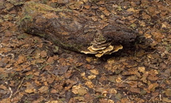 |
| Forest floor Heather Collins handmade fabric, free machine embroidery |
 |
| Detail of leaves from Forest Floor Both images from heathercollins.co.uk |
Fiona Robertson is good at this. Her embroidered pictures of the Hampshire countryside show the whole view seen by a walker (rather than just a small part of the forest floor!) It's also interesting to see how her sketches translate into final pieces.
http://www.fionarobertsonartworks.co.uk/landscape-embroidery.html
Looking at these landscapes with 'range of tone' specs on, I can see that the ones with the widest range from dark to light are the most successful in showing depth (eg the red and orange leaves one she used for the header of the page, and the dark path through the yellow flowers are much more direct and atmospheric than 'first signs' or 'autumn view' - although they both use colour beautifully.
Looking at this I think I should have a try doing a single sketch in different degrees of tonal contrast, to see what happens to it.
Carol Naylor's landscapes are more expressive than realistic, and use colour in interesting ways.
She also deliberately uses the distorting effect of the machine embroidery on duck canvas.
http://www.carolnaylor.co.uk/gallery/gallery10.html
 |
| Carol Naylor Diamonds and Rust from a Spanish landscape |
 |
| Sea of Lavender Carol Naylor That image, of a field full of lavender flowers, is one which you never forget. I notice that she has not put in the flower stalk detail in the foreground, and in fact that would distract from the movement towards the ridge of pale yellow in the middleground. |
Heather Dubreuil makes art quilts out of fabric she has dyed and then fused and stitched. They seem to be mainly of urban landscapes. They are of a size to be displayed on the wall like a painting. Here are a few examples:
 |
| Rooftop terrasse abstract in some ways makes you think |
 |
| Santa Cruz de Tenerife reminiscent of Klee partly because of the flatness I think and the limited range of colours |
 |
| Villagio Toscano The texture and colour intensity contrast between the foreground and background are very effective. |
These are much more blocky than the other landscapes which reflects what urban landscapes are like. It is more difficult to see a metaphorical or other meaning in these.
Caroline Dunn
http://carolinedunn.weebly.com/landscapes.html
Through this link, 'A walk around the block' a piece created from a sketchbook walk much like the one we've been doing in the course. She has left the sky, except in the places where the birds are flying.
I could try using different degrees of freedom /control in drawing style to contrast natural and man-made.
Laura Breitman
Another detail person, but this time with an eye on the whole image.
http://laurabreitman.net/collage/landscape/
These have a very accomplished feel to them. Attention to detail, composition, colour and tone. Very impressive and beautiful too. There is no need for meaning when it is so well done.
Note to self - all those composition sketches and emphasis on range of tone etc are worth it!
Thinking about the ideas in Contemporary Drawing, what does the use of textiles as medium bring to these pieces?
Heather Collins' forest floor - it focusses my mind on the impressive feat of producing something like that out of textiles. IE it stops being about the wonderful colours and textures of nature and becomes about the skill of the artist in duplicating it. More so than a painter? Perhaps. Because we are less used to seeing this kind of technical skill in this medium, maybe?
Laura Breitman's pieces, though, I had that awed feeling, but it was much less important than the experience of looking at something beautiful and evocative. I suppose that the use of the printed fabrics (some printed herself for the purpose) in collage add to the depth and resonance of the image.
Fiona Robertsons farm landscapes - I think that using textiles makes one aware of the stillness of them - the contemplative pace of both the sewing and the walking through the landscape. The colours are very intense in places - is that easier to do with dyed fabric and yarns than with paints?
Carol Naylors machine embroideries - definitely brings a distortion to the ground that drawing would not necessarily bring (or bring in a different way with the water effect on paper). The stitches distort the canvas in a way that makes you aware that the plants change the shape of the ground they grow in. Also machine stitching is intrinsically linear, reflecting the lines made by linear ploughing and planting of the lavender.
Heather Dubreil's art quilts - Not sure what it brings - would the same images made of coloured paper or painted in oil have less impact or interest? I don't think so necessarily, which suggests that the use of textiles is not adding any particularity to this piece of work. (But I could well be missing something).
Caroline Dunn's landscapes feel more personal, the walk round her home, and are made in traditional quotidian manner by sewing. To me this adds warmth and homeliness to her images.
Caroline Dunn
http://carolinedunn.weebly.com/landscapes.html
Through this link, 'A walk around the block' a piece created from a sketchbook walk much like the one we've been doing in the course. She has left the sky, except in the places where the birds are flying.
 |
| Winter Landscape in the Dales Caroline Dunn This has a very strong sky threatening the landscape with the darkest and lightest tones, and the freest marks. |
Laura Breitman
Another detail person, but this time with an eye on the whole image.
http://laurabreitman.net/collage/landscape/
These have a very accomplished feel to them. Attention to detail, composition, colour and tone. Very impressive and beautiful too. There is no need for meaning when it is so well done.
 |
| Laura Breitman Looking up Collage in fabric |
 |
| Detail of 'looking up' showing that it is made of fabric collage |
 |
| Laura Breitman Sunset |
 |
| Laura Breitman Under the EI |
Note to self - all those composition sketches and emphasis on range of tone etc are worth it!
Thinking about the ideas in Contemporary Drawing, what does the use of textiles as medium bring to these pieces?
Heather Collins' forest floor - it focusses my mind on the impressive feat of producing something like that out of textiles. IE it stops being about the wonderful colours and textures of nature and becomes about the skill of the artist in duplicating it. More so than a painter? Perhaps. Because we are less used to seeing this kind of technical skill in this medium, maybe?
Laura Breitman's pieces, though, I had that awed feeling, but it was much less important than the experience of looking at something beautiful and evocative. I suppose that the use of the printed fabrics (some printed herself for the purpose) in collage add to the depth and resonance of the image.
Fiona Robertsons farm landscapes - I think that using textiles makes one aware of the stillness of them - the contemplative pace of both the sewing and the walking through the landscape. The colours are very intense in places - is that easier to do with dyed fabric and yarns than with paints?
Carol Naylors machine embroideries - definitely brings a distortion to the ground that drawing would not necessarily bring (or bring in a different way with the water effect on paper). The stitches distort the canvas in a way that makes you aware that the plants change the shape of the ground they grow in. Also machine stitching is intrinsically linear, reflecting the lines made by linear ploughing and planting of the lavender.
Heather Dubreil's art quilts - Not sure what it brings - would the same images made of coloured paper or painted in oil have less impact or interest? I don't think so necessarily, which suggests that the use of textiles is not adding any particularity to this piece of work. (But I could well be missing something).
Caroline Dunn's landscapes feel more personal, the walk round her home, and are made in traditional quotidian manner by sewing. To me this adds warmth and homeliness to her images.
No comments:
Post a Comment